Last updated: May 14, 2026
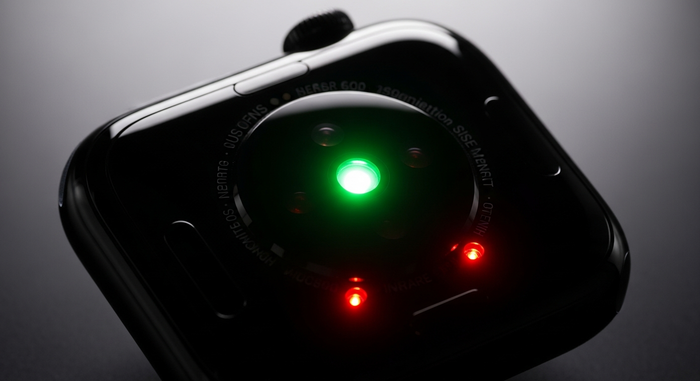
The back-crystal sensor on an Apple Watch packs green, red, and infrared LEDs alongside a photodiode array. Green drives heart-rate tracking. The red and infrared pair is what the Blood Oxygen app reads when it estimates SpO₂. Apple’s own description of the sensor groups all three colors together, but the saturation calculation rests on the red/infrared contrast alone — oxygenated and deoxygenated hemoglobin absorb those two wavelengths in opposite directions, so the watch solves for saturation from the ratio of how much each color pulses with every heartbeat. Nothing in the reading actually measures oxygen molecules; it infers them from a two-color absorption asymmetry.
Jump to
- The 70-second answer: two wavelengths, opposite absorption, one ratio
- Why red and infrared, and not green: the hemoglobin absorption crossover
- The ratio-of-ratios: how the watch turns scattered light into a percentage
- Reflectance vs transmissive: why a wrist sensor is harder than a fingertip clip
- Every failure mode is the same failure mode
- The 15-second wait, the accelerometer gate, and background measurements
- What the accuracy envelope actually means for a single reading
- Apple Watch SpO₂ optical chain at a glance
- Masimo, the ITC ruling, and the US redesign
- What to take away when your watch shows a number
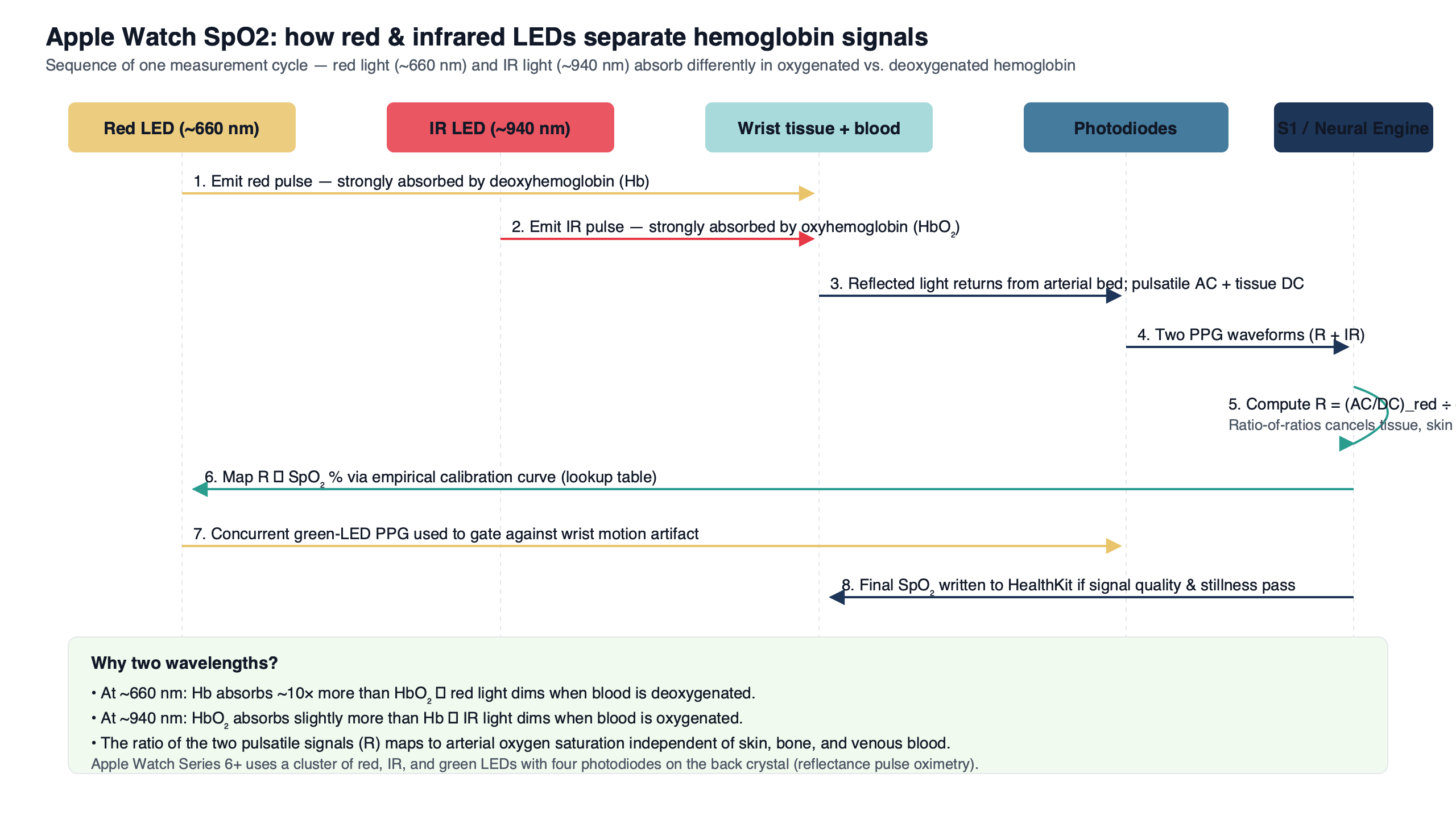
- The Apple Watch back-crystal sensor stack contains green, red, and infrared LEDs. SpO₂ specifically uses the red/infrared pair, because the two species of hemoglobin absorb red and infrared light in mirrored directions.
- Oxygenated hemoglobin (HbO₂) absorbs more infrared than red; deoxygenated hemoglobin (Hb) absorbs more red than infrared. Their absorption curves cross at an isosbestic point in the near-infrared, where both forms absorb light identically.
- Peer-reviewed evaluations of Apple Watch SpO₂ against medical pulse oximeters have reported limits of agreement on the order of a few percent SpO₂, with occasional larger outliers — wide enough that single readings are best interpreted as part of a trend.
- Tattoos, cold-vasoconstricted wrists, motion, and resting heart rates above ~150 bpm all break the same thing: the pulsatile (AC) signal the ratio-of-ratios calculation depends on.
The 70-second answer: two wavelengths, opposite absorption, one ratio
Apple’s help pages describe a “bright red light” shining against your wrist and group the back-crystal LEDs as red, green, and infrared. That framing flattens the mechanism. For SpO₂ specifically, the only two colors doing work are a visible red and an infrared your eye cannot see; the green LEDs in the same package handle heart rate. Pulse oximetry works because the two species of hemoglobin in your blood absorb those two wavelengths with mirrored preferences. Oxygenated hemoglobin lets red through and soaks up infrared. Deoxygenated hemoglobin does the opposite. Shine equal amounts of both colors into a blood vessel, measure what comes back, and the contrast between the two return signals encodes saturation directly.
That is why standard two-wavelength pulse oximeters — from the fingertip clip in a clinic to the back crystal of an Apple Watch — pick red and infrared. Green LEDs, which dominate the same watch sensor stack for heart-rate measurement, are not the contrast pair used in standard two-wavelength pulse oximetry. They are excellent at detecting pulse (which only needs an AC signal at any wavelength) and poor at separating the two hemoglobins (which needs a wavelength where the absorption coefficients diverge). Search “apple watch blood oxygen sensor explained” and you mostly get pages telling you to sit still for fifteen seconds. The actual reason those fifteen seconds exist is that they are a numerical convergence window for a two-color spectroscopy calculation.
A related write-up: single-lead ECG signal chain.
Why red and infrared, and not green: the hemoglobin absorption crossover
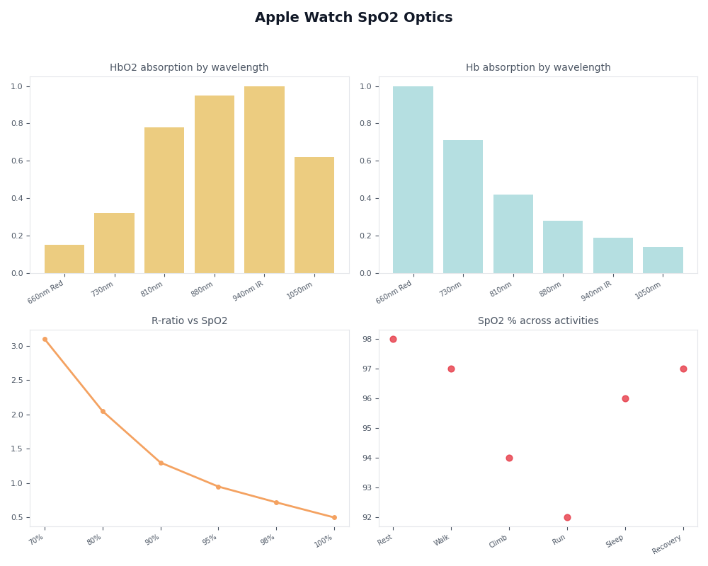
The wavelengths are not arbitrary, and the reason is visible in the molar extinction coefficient curves for HbO₂ and Hb compiled from Scott Prahl’s tabulation at the Oregon Medical Laser Center. On a log plot, the two curves trade dominance at an isosbestic point in the near-infrared, where both forms absorb light identically. Pick a wavelength well to the left of that crossover, in the visible red, and you sample a region where deoxygenated hemoglobin is substantially more absorbing than oxygenated. Pick one well to the right, in the near-infrared, and the relationship inverts: oxygenated hemoglobin absorbs slightly more, but the more important property is that absorption in that band is relatively insensitive to saturation changes and works as a stable reference.
The diagram shows the same two-curve picture in schematic form: a steep deoxygenated-hemoglobin absorption peak in the red, an oxygenated curve that rises into the infrared, and the crossover in the near-infrared where the two lines meet. The red sampling line sits in the region of maximum HbO₂/Hb contrast; the infrared line sits where the ratio is small but predictable. That asymmetry is the entire physical basis of the saturation estimate. Pick a pair of wavelengths that sit close to each other on the curves — two greens, or red plus orange — and the math has almost no signal to lock onto. The reading would be noise.
The ratio-of-ratios: how the watch turns scattered light into a percentage
The watch does not measure absorption directly. It measures a time-varying voltage at the photodiode that rises and falls with each heartbeat as arterial blood expands and contracts the vessels under the skin. That signal decomposes into a slow-changing DC component — tissue, bone, venous blood, melanin, anything that does not pulse — and a small AC component, the arterial pulsation itself. The fraction of light returning specifically from the pulsing arterial blood, AC divided by DC, is the only part that carries SpO₂ information. The rest is noise to be cancelled.
The classic algorithm — derived in Takuo Aoyagi‘s 1974 work and codified in John Webster’s Design of Pulse Oximeters in 1997 — computes the AC/DC ratio for each color separately, then divides those two ratios to get a single dimensionless number called R. SpO₂ is then read off an empirical calibration curve mapping R to saturation, built once by inducing controlled hypoxia in healthy volunteers and fitting the curve to arterial-blood gas measurements. The calibration lookup table is baked into firmware; Apple did not invent it, and every pulse-oximeter manufacturer carries its own version. What the Apple Watch contributes is the optical packaging and the signal-processing pipeline that gets a clean enough R out of a wrist instead of a fingertip.
- Interleaved LED firing. The red and infrared LEDs pulse in rapid alternation so a single photodiode array can resolve each wavelength by timing rather than needing two separate detectors.
- Photodiode readback. Backscattered intensity is digitized for both wavelengths as a time series; the two streams arrive interleaved in the same channel and are de-multiplexed in firmware.
- DC baseline removal. A slow-varying component — tissue, bone, venous blood, melanin, anything that does not pulse — is subtracted, leaving only the modulation tied to the arterial pulse.
- AC pulse isolation. The remaining heartbeat-synchronous signal is extracted for each color, with the accelerometer gating out samples corrupted by wrist motion.
- Per-color AC/DC ratio. The watch computes the AC/DC fraction separately for the red channel and for the infrared channel.
- Ratio-of-ratios (R). The red AC/DC ratio is divided by the infrared AC/DC ratio, producing one dimensionless number.
- Calibration lookup. R is mapped to a saturation percentage through an empirical curve built once from controlled-hypoxia volunteers, then baked into firmware.
That ordered pipeline makes the data path explicit: the red and infrared LEDs fire in interleaved bursts, the photodiode array reads back two superimposed signals, the firmware separates them by timing, filters out the DC tissue baseline, isolates the AC pulse, computes R for each color, and looks the answer up in a calibration table. Everything users see — a 95% reading on the wrist, a chart in the Health app, a “measurement unsuccessful” banner — falls out of that single pipeline.
Reflectance vs transmissive: why a wrist sensor is harder than a fingertip clip
A hospital pulse oximeter is a clamp that puts an LED on one side of your finger and a photodiode on the other. The light passes through the tissue; whatever the photodiode sees has crossed about a centimeter of skin, fat, and capillaries. That geometry is called transmissive pulse oximetry, and the pulsatile AC component is a relatively large fraction of the total signal because there is so much arterial blood in the optical path.
A wrist sensor cannot do that — there is nothing to clamp through. So Apple, like every other wrist-worn SpO₂ implementation, uses reflectance pulse oximetry: the LEDs and the photodiodes sit on the same surface, and the device measures backscattered light that bounces off vessels a few millimeters below the skin. The arterial path is shorter, the volume of pulsing blood is smaller, the AC signal is buried under more melanin and tissue scattering, and the signal-to-noise ratio is substantially worse than at a fingertip clip. That worse SNR is why peer-reviewed evaluations have reported wider limits of agreement than you would see for a hospital device — not because the algorithm is different, but because the geometry starts from a noisier baseline.
If you need more context, compared on-device sensor stacks covers the same ground.
Every failure mode is the same failure mode
Apple’s support page lists a series of conditions that prevent a successful reading: tattoos under the sensor, cold wrists, a clenched fist, a loose band, a resting heart rate above 150 beats per minute, and motion. The page presents these as independent quirks. They are not. They are five faces of the same single problem — anything that collapses or contaminates the AC pulsatile component breaks the ratio-of-ratios math, because R is defined as a ratio of two AC/DC values and the AC term either goes to zero or fills up with garbage.
Pigmented tattoo ink, particularly dark colors at the red wavelength, absorbs most of the visible red light before it ever reaches a vessel. The photodiode sees a flat, near-zero signal with no detectable pulse. Cold wrists cause peripheral vasoconstriction; the small arteries the sensor depends on constrict shut, and the AC pulsation flattens. A clenched fist or a too-loose band changes the static pressure on the tissue, swamping the small AC modulation with a much larger DC drift. In every case, the watch refuses to display a number not because some independent check failed, but because R could not be computed from a non-existent or contaminated pulsatile signal.
The dashboard view organizes those failure modes against the underlying mechanism. Each row is a real-world condition; each column is the part of the signal pipeline that breaks. Read across, and the lesson is that every consumer-facing error message in the Blood Oxygen app is a downstream consequence of one upstream physics problem — the AC component of the photodiode signal not being clean enough for R to converge.
The 15-second wait, the accelerometer gate, and background measurements
The fifteen-second on-demand window is most plausibly read as a span long enough to capture enough cardiac cycles for the ratio of AC/DC values across both wavelengths to settle into a stable estimate. At a resting heart rate of 60–80 bpm, fifteen seconds is fifteen to twenty heartbeats — enough samples that a running average of R stops jumping around between consecutive sub-windows. Apple has not published the internal stopping criterion, and any specific claim about firmware confidence bounds would be a guess; what is observable is that shorter windows on similar reflectance devices tend to publish numbers that swing several percent between consecutive readings, and longer windows correct that at the cost of user patience.
Motion is the more interesting constraint. The accelerometer is not just a step counter here; it is a gate that throws out optical samples taken while the wrist is moving, because mechanical motion of the skin against the back crystal injects a non-cardiac AC component into the photodiode signal that the algorithm cannot tell apart from a real pulse. That is why an on-demand reading fails if you swing your arm, and why the watch opportunistically samples in the background when its sensors register stillness during sleep or low activity. Apple’s “How to use the Blood Oxygen app” page gives the user-facing instruction (“rest your arm flat on a table or in your lap”) without saying that the reason is accelerometer-based sample rejection. The instruction is real; the mechanism it serves is what we just described.
There is a longer treatment in H2 chip sensor fusion.
What the accuracy envelope actually means for a single reading
Peer-reviewed evaluations of Apple Watch SpO₂ against medical-grade pulse oximeters have generally reported population-level biases close to zero with 95% limits of agreement on the order of a few percent SpO₂, and occasional individual readings that diverge by considerably more. The exact numbers depend on the device generation, the reference oximeter, and the patient population — readers who want a current pooled estimate should consult an up-to-date systematic review on PubMed rather than rely on a single figure quoted here.
In practical terms, an envelope of a few percent means that a 94% watch reading could correspond to a noticeably wider band of true arterial SpO₂. Limits of agreement are not a confidence interval around any single reading — they describe the range within which roughly 95% of paired differences between the watch and a reference oximeter fall across the studied population, so the right way to read the figure is as an envelope of plausible disagreement, not an error bar on the specific number on your wrist. Either way, the envelope is wide enough that a value the watch reports as borderline-low could be either entirely normal or genuinely hypoxic. The watch is a screening surface for trends and abnormal patterns over many readings, not a diagnostic instrument for any single number. Apple’s product documentation says exactly that, rarely in those terms — the limits-of-agreement context is what turns the disclaimer into something meaningful instead of legal boilerplate.
life-saving wrist sensors goes into the specifics of this.
Two caveats sit on top of that interval. Most of the pooled peer-reviewed work on Apple Watch SpO₂ to date has focused on earlier Series hardware; later Series and Ultra revisions have not all been re-validated to the same standard. And the broader pulse-oximetry literature — Sjoding et al., New England Journal of Medicine, 2020 — found that fingertip pulse oximeters underestimate true hypoxemia at a higher rate in Black patients than in white patients, an effect attributable to melanin absorption at the red wavelength. Reflectance wrist measurement uses the same red wavelength against a skin surface, so the same direction of bias is physically expected, but no Apple-Watch-specific dataset has yet quantified the magnitude on the wrist.
Apple Watch SpO₂ optical chain at a glance
| Stage | What it does | What can go wrong | User-visible symptom |
|---|---|---|---|
| Red LED | Samples a wavelength where Hb absorbs substantially more than HbO₂ | Tattoo ink absorbs light before reaching vessels; melanin attenuates similarly | Measurement unsuccessful; biased low reading |
| Infrared LED | Samples a wavelength where HbO₂ absorbs slightly more than Hb; serves as reference | Invisible to user; failures rarely diagnosable by eye | Silent contribution to noisy R |
| Photodiode array | Measures backscattered intensity for each wavelength over time | Loose band lets ambient light leak in; tight band crushes capillaries | “Make sure your watch is snug” prompt |
| AC/DC separation | Filters out the DC tissue baseline, isolates pulsatile component | Cold-vasoconstricted wrists, fist clench, motion all collapse the AC term | 15-second timer expires with no reading |
| Ratio-of-ratios (R) | Divides red AC/DC by infrared AC/DC to get one dimensionless number | If either AC term is near zero, R is undefined | “Measurement unsuccessful” |
| Calibration lookup | Maps R to SpO₂ via empirical curve built from controlled-hypoxia volunteers | Curve does not extend to very low saturations; melanin bias inherited | Reading falls outside the displayed range or fails to publish |
Source: synthesis of Apple’s public support documentation, peer-reviewed accuracy evaluations of Apple Watch SpO₂, the Aoyagi 1974 derivation, Apple’s August 2025 announcement on the redesigned US blood-oxygen feature, and March 2026 MacRumors reporting on the ITC review of that redesign.
Masimo, the ITC ruling, and the US redesign
According to Apple’s August 2025 newsroom post, Apple shipped a redesigned implementation for US watches in which the actual SpO₂ calculation runs on a paired iPhone and the result lives in the Health app on the phone rather than on the watch face. The most recent public status we can point at is March 2026 MacRumors reporting that an ITC judge ruled the redesign does not infringe Masimo’s patents. The litigation history of this dispute is long enough that any reader checking the situation months from now should expect the surface to have moved; the linked sources are the right starting point, not this paragraph.
None of this changes the sensor. For users it means the on-wrist immediacy is gone in the US. For understanding the device it tells you the SpO₂ measurement was always a pipeline that could be cut at any stage.
There is a longer treatment in broader health ecosystem play.
What to take away when your watch shows a number
The Apple Watch is, in physical terms, a wrist-worn reflectance spectrophotometer with a firmware calibration curve. Every failure mode and every quirk you encounter follows from that — the fifteen-second wait is a convergence window for two-color absorption math, the tattoo and cold-wrist warnings are about a collapsing AC pulsatile signal, and the iPhone handoff on redesigned US watches is a software cut in a pipeline whose physics is unchanged. The headline number is not a measurement of oxygen; it is an inference about oxygen, with reported limits of agreement wide enough that any single reading should be read as part of a trend rather than a verdict. Treat the watch as a screening device that flags patterns over weeks, hand the verdict to a fingertip clip or a clinician when a single number actually matters, and you are using the sensor for what its physics will and will not support.
There is a longer treatment in where the Watch is heading.
Sources
- Scott Prahl, Oregon Medical Laser Center hemoglobin extinction coefficient tabulation — primary numerical source for HbO₂ and Hb absorption spectra and the near-infrared isosbestic point.
- Sjoding M.W. et al., “Racial Bias in Pulse Oximetry Measurement,” New England Journal of Medicine, 2020 — primary evidence for the melanin-related red-wavelength bias.
- Apple Support: How to use the Blood Oxygen app on Apple Watch — official measurement procedure and listed failure conditions.
- Apple Newsroom, “An update on Blood Oxygen for Apple Watch in the U.S.,” August 2025 — official description of the US redesign and the iPhone-side calculation.
- Apple, “Blood Oxygen app on Apple Watch” (healthcare provider document, October 2022) — Apple’s most technical public description of the sensor pipeline and its intended use.
- MacRumors, “ITC Judge Rules Apple Watch Blood Oxygen Workaround Does Not Infringe Masimo Patents,” March 2026 — most recent case-status reporting on the ITC review of the redesign.